In this tutorial we will get to learn how to create a simple note taking app for the web environment that saves and retrieves text notes using HTML5 technologies, specifically the HTML5 Local Storage. This program will be a Web Application using Responsive Web Design techniques, and will therefore work on any screen size, on both mobile and desktop browsers.
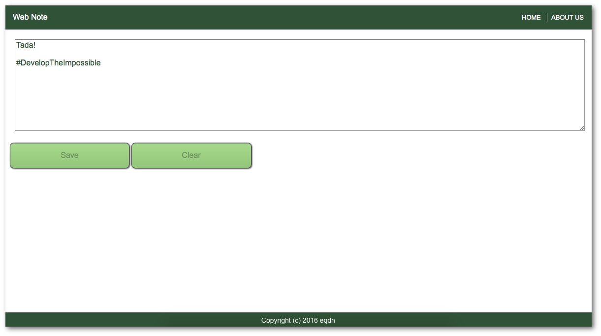
At the end of this tutorial, we will have an application that will look somewhat like this:
To start with, we will need to create the content of our page. Create a file named "index.html" and place the following code inside your new file:
<!DOCTYPE html>
<html>
	<head>
		<title>HTML5 Application Development</title>
	</head>
	<body>
		<div id="header">
			<div id="name">Web Note</div>
			<div id="menubutton"><a id="menulink" href="#">MENU</a></div>
			<div id="menu" class="hiddenmenu">
				<div class="menuitem"><a id="home" href="#">Home</a></div>
				<div class="menuitem"><a id="about" href="#">About us</a></div>
			</div>
			<div class="clear"></div>
		</div>
		<div id="container">
			<textarea id="area" rows="10" cols="50"></textarea>
		</div>
		<div class="footer">
			<p>Copyright (c) 2016 eqdn</p>
		</div>
	</body>
</html>
As you have noticed, we have used different HTML Tags to structure our content. Since HTML is primarily used for providing the document structure and content, the above file will not yet look very nice in a browser (you are totally welcome to try). To make it look a little bit better, we can use CSS to specify the look and feel.
To do this, create a file named "style.css" and place this code:
body {
	margin: 0px;
}
#header {
	background: #325232;
	color: white;
	font: arial;
	font-size: 16px;
	padding: 16px;
}
#header > #name {
	font-family: Arial, Sans-serif;
	display: inline-block;
}
#menu a, #menubutton a {
	text-decoration: none;
	color: white;
	text-transform: uppercase;
	font-family: Arial, Sans-serif;
	font-size: 13px;
}
.clear {
	clear: both;
}
#container {
	margin: 20px 20px 20px 20px;
}
#area {
	width: 100%;
	height: 100%;
	font: 1em arial;
	color: rgba(50, 82, 50, 1.0);
}
#area:focus {
	color: rgba(50, 82, 50, 1.0);
	border: 2px solid #96c56f;
	box-shadow: 0px 1px 1px #888888;
}
.footer {
	width: 100%;
	background-color: #325232;
	height: 32px;
	position: fixed;
	bottom: 0px;
}
.footer > p {
	margin: 8px;
	color: white;
	font: 14px arial;
	text-align: center;
}
That is called a style sheet, written in a language named "CSS". In our CSS file, as you have noticed, we have used "CSS Selectors" to reference elements used in our HTML. For example, in the above CSS file we used the following definitions:
.footer - Here we prepend a "dot" character to reference an element class name. This rule, therefore, affects all elements that have the class name "footer".
#header - Here we prepend a hash character ("#") to reference an element ID. This rule, therefore, affects the element that has the ID "header" (there should only be one; element IDs are supposed to be unique).
#menu a, #menubutton a - This selects all "a" elements (which are links) that are inside the element with ID "menu", AND all "a" elements that are inside the element with ID "menubutton"
#header > #name - Select all elements with element ID "name" where the immediately parent of that element is an element with an element ID "header"
Now also create a file named "functionality.js" and place this Javascript code:
window.onload = function() {
	document.getElementById('menulink').onclick = function() {
		var menu = document.getElementById('menu');
		if(menu.className != 'shownmenu') {
			menu.className = 'shownmenu';
		}
		else {
			menu.className = 'hiddenmenu';
		}
	}
}
Note that we have placed the content, style and functionality of our web app in different files. Now we will link the style sheet and functionality in the HTML file. Add these tags inside your head element:
<link rel="stylesheet" type="text/css" href="style.css" />
<script src="functionality.js"></script>
NOTE: Make sure to save all the files we created in one directory.
Improving mobile compatibility
To make the page mobile aware, add the viewport configuration inside the head element of your page:
<meta name="viewport" content="initial-scale=1, maximum-scale=1" />
When designing modern web applications, we need to keep in mind that these applications may be accessed not just on desktop browsers, but also on laptops, tablets and smartphones, or other such devices that we may not quite expect. With that in mind, we need the make sure that our application will look good on any screen size. This kind of design is often called Responsive Web Design, and is commonly achieved through the use of Media Queries.
Since our web app is "mobile aware", now we can also configure alternative layouts depending on the screen / display size by means of Media Queries. Now we will add media queries to our style sheet by adding these lines of code in the style.css file:
@media only screen and (min-width: 600px) {
	#menu {
		float: right;
		display: inline-block;
	}
	.menuitem {
		display: inline;
	}
	.menuitem + .menuitem {
		border-left: 1px solid white;
		margin-left: 8px;
		padding-left: 8px;
	}
	#menubutton {
		display: none;
	}
}
@media only screen and (max-width: 599px) {
	#menubutton {
		display: inline;
		float: right;
	}
	#menu {
		position: absolute;
		top: 48px;
		right: 0px;
		background: #325232;
		padding: 16px;
	}
	.shownmenu {
		display: block;
	}
	.hiddenmenu {
		display: none;
	}
	.menuitem {
		display: block;
	}
	.menuitem + .menuitem {
		margin-top: 8px;
	}
}
Media query only
The media query keyword only is ignored by compliant browsers (it is treated as if it wasn't there). It also causes older browsers (that do not understand media queries) to ignore the entire media query, and therefore enables backwards compatibility.
Now that we have that in place, open the HTML file in a browser and try to resize the browser to make the window smaller. Your application should look something like this:
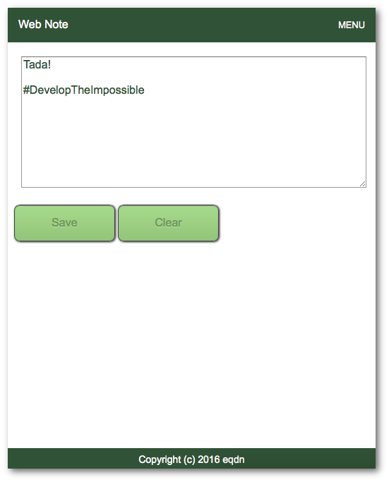
As you noticed, the menu on the top right corner adjust based on the size of the browser. Now let's change something in our code to make it more cool, replace this:
<div id="menubutton"><a id="menulink" href="#">MENU</a></div>
.. With this:
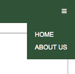
<div id="menubutton"><a id="menulink" href="#">☰</a></div>
That is what we call the "burger icon". The menu in the upper right corner should now look something like this:
We will use "CSS buttons" for our buttons. We will add our buttons by using the following code in a new div tag after and at the same level as the "container" div tag.
<div id="controls">
	<p><a href="javascript:save();" class="button">Save</a>
		<a href="javascript:clear();" class="button">Clear</a></p>
</div>
In our style sheet, we add the look of the buttons:
#controls {
	margin-left: 10px;
}
a.button {
	width: 15%;
	display: inline-block;
	background: -webkit-linear-gradient(top, #a9db80, #96c56f);
	background: -moz-linear-gradient(top, #a9db80, #96c56f);
	background: -ms-linear-gradient(top, #a9db80, #96c56f);
	background: -o-linear-gradient(top, #a9db80, #96c56f);
	background: linear-gradient(to bottom, #a9db80, #96c56f);
	border-radius: 8px;
	border: 1px solid #444444;
	box-shadow: 0px 1px 1px #888888 inset, 1px 1px 3px #222222;
	color: #6d954e;
	text-decoration: none;
	text-align: center;
	padding: 16px 32px 16px 32px;
	text-shadow: 0px 1px 1px rgba(255, 255, 255, 0.4);
	font-family: arial;
}
a.button:hover {
	background: rgba(120, 160, 120, 1);
	color: white;
}
a.button:active {
	background: rgba(80, 120, 80, 1);
}
We will then also add functionality to the two new buttons that we added. For our purposes, we will use HTML5 Local Storage for storing data. To do this, add the following code blocks in our JavaScript file. The first function will check if the browser supports local storage:
function check_web_storage_support() {
	if(typeof(Storage) !== "undefined") {
		return(true);
	}
	else {
		alert("Web storage unsupported!");
		return(false);
	}
}
This one will retrieve the saved note:
function display_saved_note() {
	if(check_web_storage_support() == true) {
		result = localStorage.getItem('note');
	}
	if(result === null) {
		result = "No note saved";
	}
	document.getElementById('area').value = result;
}
This one implements the functionality for the "Save" button:
function save() {
	if(check_web_storage_support() == true) {
		var area = document.getElementById("area");
		if(area.value != '') {
			localStorage.setItem("note", area.value);
		}
		else {
			alert("Nothing to save");
		}
	}
}
This implements the functionality for the "Clear" button:
function clear() {
	document.getElementById('area').value = "";
}
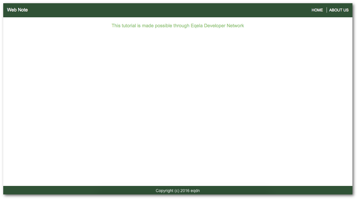
When we choose "About us", we should see this:
To do that, we will need to also add these lines of code in the "window.onload" function:
document.getElementById('about').onclick = function() {
	document.getElementById('container').innerHTML = "";
	document.getElementById('controls').innerHTML = "";
	document.getElementById('menu').className = 'hiddenmenu';
	var container = document.getElementById('container');
	var p = document.createElement('p');
	p.id = 'aboutus';
	container.appendChild(p);
	var text = document.createTextNode("This tutorial is made possible through Eqela Developer Network");
	p.appendChild(text);
}
And this to our style sheet:
#aboutus {
	margin: 8px;
	color: #96c56f;
	font: 16px arial;
	text-align: center;
}
Also add these lines of code inside the "window.onload" function:
var home = document.getElementById('container').innerHTML;
var controls = document.getElementById('controls').innerHTML;
display_saved_note();
document.getElementById('home').onclick = function() {
	document.getElementById('container').innerHTML = home;
	document.getElementById('controls').innerHTML = controls;
	document.getElementById('menu').className = 'hiddenmenu';
	display_saved_note();
}
When you are done with that, congratulations, we now have a simple web note app.
How about using the cloud as the repository instead of local storage? Discover how to create a simple web server in rest-api-development-with-sympathy.